Web Designer-Focused Colour Schemes for 2025, Proven to Boost Conversions
Top Color Palette Trends for Web Design in 2025
In the ever-evolving world of web design, colour plays a crucial role in creating an engaging and effective user experience. Here are some of the most significant colour palette trends expected to dominate in 2025.
Bold and Dynamic Palettes
One of the key trends for 2025 is the use of bright and bold tones like Infrared red and Pure purple, combined with nuanced shades such as purple-tinged grey and cloud white (soft off-white) to create dynamic yet grounded palettes. These vibrant hues are balanced by earthier tones, creating a harmonious blend that catches the eye without overwhelming the viewer.
Natural and Sophisticated Palettes
Another popular trend is the combination of earth tones with prominent reds and greens, enriched by deep blues and natural greys. This sophisticated, natural feel offers a refreshing departure from the bright and bold palettes, providing a calming effect while maintaining visual interest.
Playful and Nostalgic Palettes
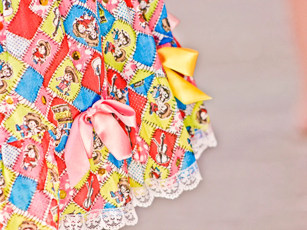
For those seeking a more whimsical approach, playful, nostalgic palettes featuring candy colors, neon bubblegum, lavender purples, holographic teals, and iridescent pinks are on the rise. These palettes evoke childhood memories and stand out in crowded digital spaces, making them a great choice for brands looking to make a bold statement.
The Impact of Colour on User Behaviour and Conversions
Colour plays a pivotal role in shaping user behaviour and conversions. Up to 90% of first impressions about products come from colour, and over 92% of consumers rank visual appearance as their top purchasing factor. Specific colours trigger emotional responses that directly affect conversion rates.
For instance, red creates urgency and excitement, proven to increase conversions by about 21% when used for CTAs. Blue inspires trust and calm, making it ideal for finance and healthcare, appealing widely to men and women. Green evokes growth and safety, increasing conversions by roughly 6.3%, especially for wellness and eco-friendly brands.
Strategic Use of Colour for Enhanced User Experience
Applying these colours strategically helps users navigate websites better, form positive brand impressions, and respond more effectively to calls to action, which significantly boosts engagement and purchasing behaviour. Tools like Coolors.co can help designers quickly generate trendy palettes and test contrast with ease.
Accessibility and Inclusivity
While vibrant colours can grab attention, it's essential to ensure that your palette meets WCAG (Web Content Accessibility Guidelines) standards. High-contrast text and accessible hues are key for usability and inclusivity. Tools like Contrast Checker by WebAIM can help ensure all elements on your site are readable.
AI and Personalised Palettes
In 2025, AI tools like Khroma AI are learning aesthetic preferences and suggesting palettes that align with your style. These tools can help streamline the design process, ensuring that your chosen palette is not only on-trend but also a perfect fit for your brand.
In conclusion, the right combination of colours can significantly enhance the emotional connection, grab attention, and improve usability, leading to increased user engagement and higher conversion rates for websites. As we move into 2025, web design is more emotionally driven and focuses on conversion, making the choice of colour palette a critical decision for any digital brand.
In 2025, technology like AI tools such as Khroma AI will learn aesthetic preferences and suggest color palettes that align with a designer's style, making the process more streamlined and essential for brands looking to stay on-trend. On the other hand, these vibrant and trendy color palettes, be it bold and dynamic, natural and sophisticated, or playful and nostalgic, should always consider accessibility and inclusivity, ensuring they meet WCAG standards for high-contrast text and accessible hues.


